Back stories at the Maine Photography Show
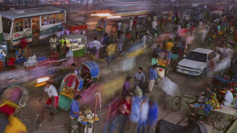 The Jim Taliana Best in Show at the 2017 Maine Photography Show: “My Brain on Dhaka” by Meredith Kennedy, Portland.
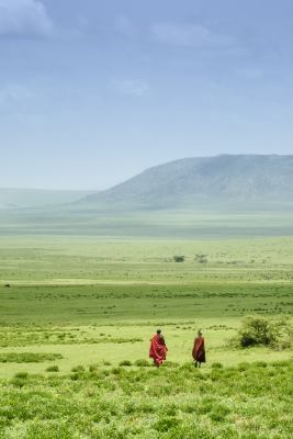 2017 Maine Photography Show, First Place, Red Green & Blue Landscape, Cory Gardiner of Woolwich
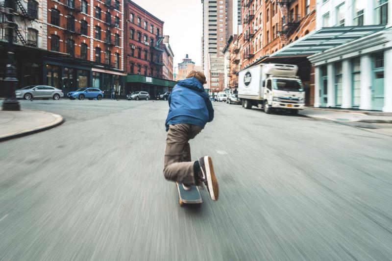 2017 Maine Photography Show First Place Student: “The Daily Commute,” James Lynch, Falmouth.
 2017 Maine Photography Show Third Place, B&W: “Southport in the Fog,” Michelle Amero.
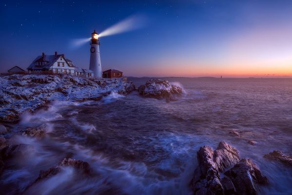 2017 Maine Photography Show First Place Color: “Night Turns into Day,” Jeffrey Bazinet.
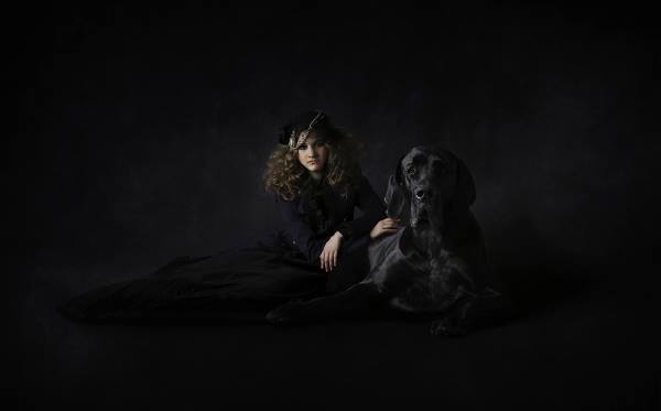 Lauren DelVeccio’s “Keeper,” second place, Color category, 2017
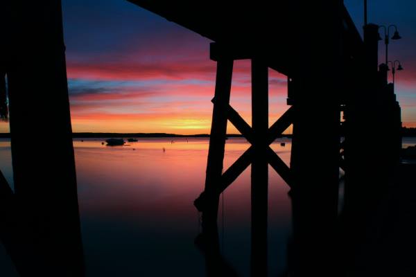 Second Place, Student, “Sunrise Over Casco Bay,” - Skyler Pitch, 2017
 Third Place, Color: “Port Clyde” Benjamin Willliamson 2017
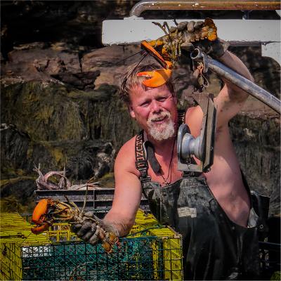 Maine Photography Show Third Place Student: “You Bring Me Luck” - Keagan Adams-Smith
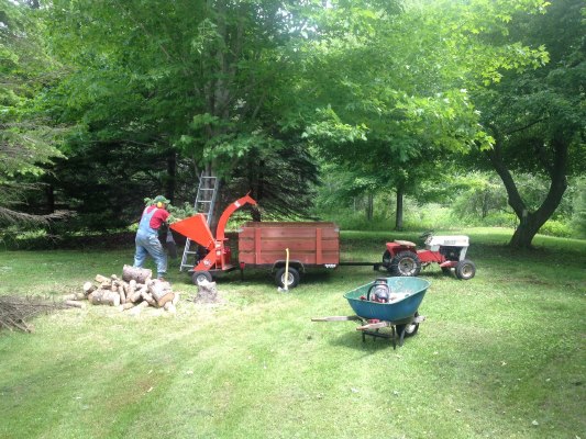 2017 Maine Photography Show Third Place Red-Green-Blue: “Yard Work” by Natalie Masse.
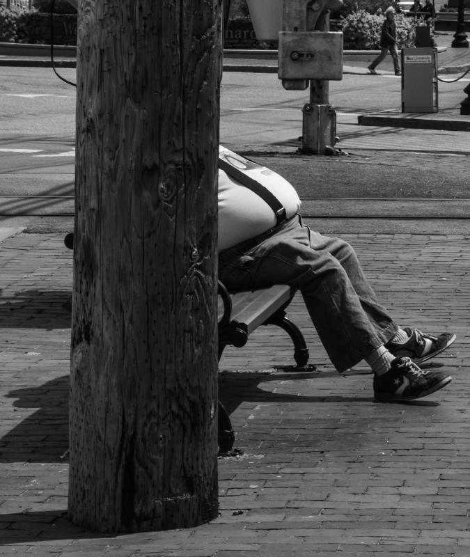 B&W First Place 2017 Maine Photography Show : John Kaminski “Seated.”
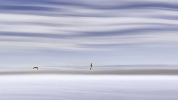 2017 Color Honorable Mention, Maine Photography Show: Caroline Samson, “Beach Walk.”
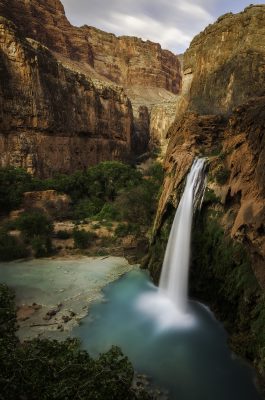 2017 Honorable Mention Red-Green-Blue Landscape, Maine Photography Show: “Havasu Falls,” Carol Liscovitz
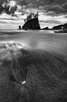 “Cast” 2017 Honorable Mention B&W, Maine Photography Show, by Matt Stapleton.
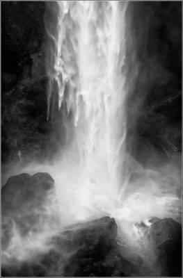 2017 Maine Photography Show B&W Honorable Mention, “Tall Falls” by Knapp Hudson.
 The Jim Taliana Best in Show at the 2017 Maine Photography Show: “My Brain on Dhaka” by Meredith Kennedy, Portland.
 2017 Maine Photography Show, First Place, Red Green & Blue Landscape, Cory Gardiner of Woolwich
 2017 Maine Photography Show First Place Student: “The Daily Commute,” James Lynch, Falmouth.
 2017 Maine Photography Show Third Place, B&W: “Southport in the Fog,” Michelle Amero.
 2017 Maine Photography Show First Place Color: “Night Turns into Day,” Jeffrey Bazinet.
 Lauren DelVeccio’s “Keeper,” second place, Color category, 2017
 Second Place, Student, “Sunrise Over Casco Bay,” - Skyler Pitch, 2017
 Third Place, Color: “Port Clyde” Benjamin Willliamson 2017
 Maine Photography Show Third Place Student: “You Bring Me Luck” - Keagan Adams-Smith
 2017 Maine Photography Show Third Place Red-Green-Blue: “Yard Work” by Natalie Masse.
 B&W First Place 2017 Maine Photography Show : John Kaminski “Seated.”
 2017 Color Honorable Mention, Maine Photography Show: Caroline Samson, “Beach Walk.”
 2017 Honorable Mention Red-Green-Blue Landscape, Maine Photography Show: “Havasu Falls,” Carol Liscovitz
 “Cast” 2017 Honorable Mention B&W, Maine Photography Show, by Matt Stapleton.
 2017 Maine Photography Show B&W Honorable Mention, “Tall Falls” by Knapp Hudson.
The Maine Photography Show awards presentations at the Boothbay Region Art Foundation gallery drew its traditionally large crowd on April 7. Photographers — from high school students to the aspiring, seasoned and professional — along with friends, family and the MPS Committee members had time to wine and dine — the event was catered by Boat House Bistro, so ..YUM! — and scope out the selections by juror Marc Muench for the 12th annual show.
Four very large and stunning images by Muench are on display on the back wall of the Art Foundation. For more of Muench’s images, visit https://www.marcmuench.com/
Before announcing the top prize, show coordinator, photographer and BRAF board member Bruce Burnham informed the group that the MPS Committee had unanimously agreed to rename it The Jim Taliana Best In Show, in honor of the MPS founder and its first chairman 12 years ago.
“Jim wasn’t only a great artist, he was a funny, funny man who could do anything with any kind of tool — a paintbrush or a camera,” Burnham said.
Of the 869 photos entered for jurying, 106 were selected. Every one of those pictures tells a story and every photographer has a story about his or her picture, like The Jim Taliana Best In Show recipient Meredith Kennedy of Portland. Her photo “My Brain on Dhaka” was taken in Dhaka, Bangladesh, during a two-week visit with a medical group. Dhaka’s population is in the tens of millions and they are in motion all of the time. When out during the day on her own, Meredith said she always dressed like the women of Bangladesh including covering her head. She said it was a comfortable way to dress in a very hot place.
“I went out at night, spending the hour just after sunset (called the “blue” hour) with a guide and my tripod,” Meredith explained. “I knew the shot I wanted to take and my guide found different vantage points for me to shoot from. I finally got this image. It’s all about the shutter speed; it depends on how long it’s open. In this city nobody stands still very long, but in the photograph some people appear to be standing still. There’s this constant stream of humanity ...”
Said Muench of Kennedy’s photograph, “The combination of motion and static grabbed my attention, then the colors moved my eyes through the scene, and then I spent an exorbitant amount of time studying all the interesting little details scattered about. The processing is spot on, no fake colors needed, just the right amount of exposure, coupled with the perfect shutter speed gives this image the Best In Show award.”
Muench’s comments are right on — as you’ll see when you view it yourself. I found I could hear the sounds of the city while looking at “My Brain on Dhaka” — and blended with the colors and movement ... it’s almost like being there, providing you’re willing to surrender yourself to the image. No passport required.
James Lynch took First Place in the Student category. This Falmouth High School student shot his winning photograph while skateboarding for the day throughout NYC with his friend Parker Pearson. James said he saw a really interesting shot when they were moving along a street in Tribeca on the boards. He decided to stop and take out his camera.
“I was skating behind him, crouching really low on my board,” James said. “To get the motion in the foreground I used a long shutter speed while trying to keep the camera steady. After I shot four or five times that was the one I really liked. I had to stay low so all of the buildings and Parker were in focus.”
The image draws the viewers in without question. When the juror’s remarks were read prior to announcing James’ name, there was a collective, knowing “ahhh” among everyone gathered at BRAF. Everyone knew the photo and knew how good it was.
As it turns out, this was James’ third year participating. Last year, his image of the Brooklyn Bridge earned an honorable mention in the student category.
The names of the first place recipients in the color, B&W, special theme (Red, Green & Blue Landscape), and student categories were released on the Boothbay Register website and Facebook page the morning after the event.
And now ... drum roll please ... here is the complete list of placing photographers including Muench’s remarks.
Color category
First Place Color: “Night Turns into Day,” Jeffrey Bazinet - Muench's comments: The transition of the dawn hour is tricky to capture in a still photo, and this does it well. Not only is the composition excellent, but the processing achieves a dreamy quality, giving the entire scene a bit of serenity. The snow, light beam and wispy waves all add to the fun of this image.
Second Place Color: “ Keeper,” Lauren DelVecchio - Muench's comments: This is a fantastic use of black, the absence of color, to highlight the colorful subject, the girl's face. The light is soft and enough is pumped into the darks giving them texture, which adds great depth. The timing is beautiful, capturing the dog is hard enough, but having the girl's expression ideal in the same frame is a great testimony to a successful photographer.
Third Place Color: “Port Clyde,” Benjamin Williamson - Muench's comments: Spectacular array of detail, texture and color. My eyes bounce all round enjoying all the interesting subjects. This was a good example of authentic colors in a real life scenario. It's just what my mind would conjure up if asked what a Maine fishing harbor looked like.
Honorable Mention Color: “Modern Gothic,” Timothy Lynch - Muench's comments: I wish the feet had been included, but the expressions on the children's faces kept me coming back multiple times. Each time I revisited this image, it grew on me, forcing me to give this honorable mention.
Honorable Mention Color: “Beach Walk,” Caroline Samson - Muench's comments: I'm always open to alternative ways of creating images, and this particular method worked, giving movement to a fun scene. I also appreciated the scale of the dog and walker.
Black & White category
FIRST PLACE B&W: “Seated” by John Kaminski, Portland - Muench comment: I laughed so hard when I first saw this; thanks for the clever scene. It's not the large belly that made me chuckle, but the fun juxtaposition of the sitting man and the walking person. The story is more interesting without the larger man’s appearance, as it leaves the imagination running (no pun) and the attention is given to the walker in the background. Very well done!
SECOND PLACE B/W: “Beacon,” Doug Van Kampen - Muench's comments: Black and white landscapes need texture, scale and a good visible control of the tonal values. This scene has all that and a great mood in addition. The lighthouse is perfectly situated on the horizon, giving it separation at its smaller size, offering a great sense of the large coastal rocks that surround it.
THIRD PLACE B/W: “Southport in the Fog,” Michelle Amero (Southport) - Muench's comments: I normally don't care for overly textured images, but this was so well done that I could not resist giving it an award. The boats in the fog and behind the rocks and trees give depth in what would have been a good image without the texture. I enjoyed the use of the texture as a way to date the scene and/or adding a painterly, impressionistic quality to it, without being overboard.
Honorable Mention B/W: “ Tall Falls,” Knapp Hudson - Muench's comments: This is a powerful scene of falling water exaggerated by the vertical orientation. I find the graphics of the large boulders gave an interesting base to the scene. The processing is spot on, leaving great textures in the falling water and just enough detail in the dark rocks.
Honorable Mention B/W: “Cast,” Matt Stapelton - Muench's comments: This image has beautiful tones and a strong composition. I find the partially wet sand interesting and it creates a good break in the large sandy beach.
Student category
FIRST PLACE Student: First Place Student, The Daily Commute, James Lynch (Falmouth) - Muench's comments: This image stood out immediately. The clever use of movement trailing a skateboarder through the city is fun and makes what could be a very simple scene magical. Everything about this picture works - the position of the boy, his foot, his head against the buildings in the distance and the light. Great work!
SECOND PLACE Student: “Sunrise Over Casco Bay,” Skyler Piltch - Muench's comments: I always appreciate an image that utilizes shadows and the shapes they make; this scene does just that. The colors are spot on and the distant boats add scale to what could be an ordinary sunset picture.
THIRD PLACE Student: “You Bring Me Luck,” Keagan Adams-Smith - Marc Muench's comments: A rather gritty portrayal of the lobster job in Maine, and the fairly well done composition work together, making this a successful image.
Honorable Mention: “ Enslaving Beauty,” Arianna Coan-Prichard - Muench's comments: I enjoy the light and shadow on the model's face, offering interest to a well lit beauty shot.
RGB Landscape category (juror-created)
FIRST PLACE: RGB Landscape, “Maasai,” Cory Gardiner (Woolwich) - Muench's comments: This is a great fulfillment of the assignment while exhibiting scale, texture, composition and most importantly, the nature of the Maasai people. I enjoy the simple light and processing, keeping the final piece very natural. I'm drawn into the scene, wishing I were there walking along with them.
SECOND PLACE: RGB Landscape, “Seljalandfoss,” Stephen Fabricius - Muench's comments: What a great scene, with spectacular light. This is a very difficult image to capture; I know this having walked behind this waterfall many times at sunset, only to get soaked by the mist. The flowers along the base add a nice touch to the spectacular scene. Wonderful processing, coupled with incredible light, made this an easy choice for an award winner.
THIRD PLACE: RGB Landscape” “Yard Work,” Natalie Masse - Muench's comments: A little bit of rural America came through loud and clear in this portrayal of a working man. The use of the primary colors is successful in highlighting the subject without looking forced. The processing appears nonexistent, leaving a light and airy feel to heighten the colors even more.
Honorable Mention: RGB Landscape, “West Quoddy Headlight” Nancy Greindl - Muench's comments: A creative use of the theme coupled with an interesting subject helped this one. There were many lighthouses to choose from, and this one stood out.
Honorable Mention: RGB Landscape, “Havasu Falls,” Carol Liscovitz - Muench's comments: A beautiful scene with good composition, light, and color. The theme is fairly well represented, and the post processing is honest.
“Getting in this show you are all winners,” Burnham said in conclusion. “And ... mine is upstairs on the left.”
The show runs through Friday, May 5. Boothbay Region Art Foundation, located at 1 Townsend Avenue in Boothbay Harbor, is open Thursday through Sunday, 11 a.m. to 5 p.m.
Event Date
Address
1 Townsend Avenue
Bootihbay Harbor, ME 04538
United States


